From Inspiration to Design
The Colours of the Atlantic Coast: Why Every Designer Should Look Beyond Flowers
One of the greatest mistakes a designer can make is to look only within their own discipline for inspiration.
As florists, we naturally spend hours studying flowers, foliage and arrangements. Yet some of the most exciting ideas are waiting outside the flower market—in architecture, fashion, ceramics, textiles and, perhaps most importantly, nature itself.
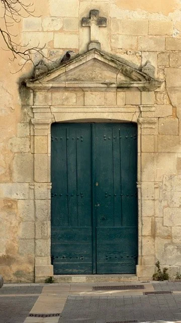
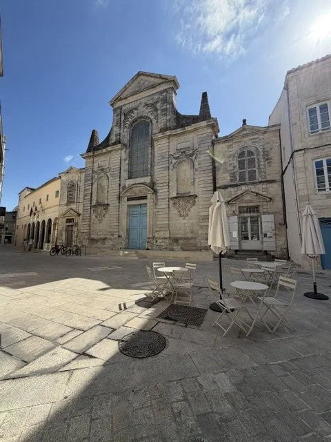
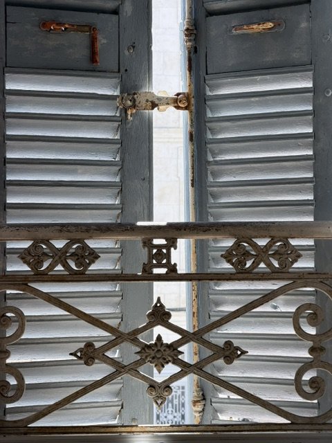
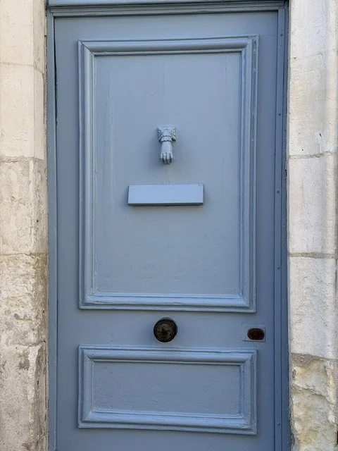
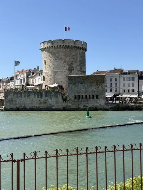
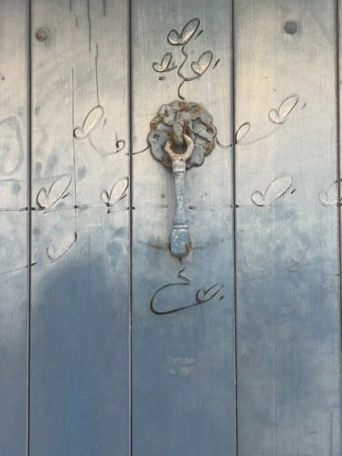
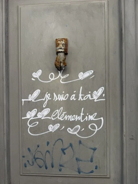
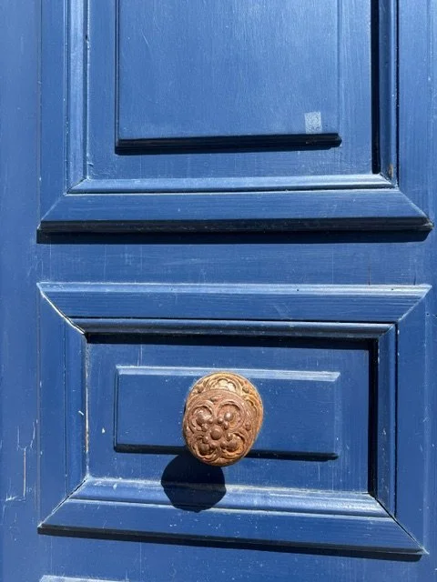
During my recent journey along France's Atlantic coast, I found myself constantly looking up rather than down. Instead of searching for flowers, I became fascinated by the colours surrounding me. The weathered harbour doors of La Rochelle, painted in soft sea greens, muted greys and faded blues, told stories of decades spent facing salt, wind and sunlight. The Atlantic itself changed colour every hour; sometimes deep blue, then grey-green, then almost silver beneath the changing sky.
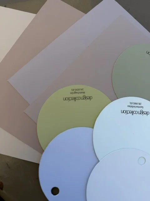
As I walked through the old harbour, camera in hand, I realised I was collecting something far more valuable than photographs. I was collecting a colour palette.
Long before I founded Berlin Flower School, I worked as a trend forecaster for the Deutsche Mode Institut in Düsseldorf. My role was to analyse emerging design movements, colour directions and cultural influences that would later shape fashion, interiors and product design. One of the most important lessons I learned during those years was that trends rarely begin within a single industry. They emerge from broader cultural shifts and from the environments we live in.
That lesson has stayed with me throughout my career as a florist.
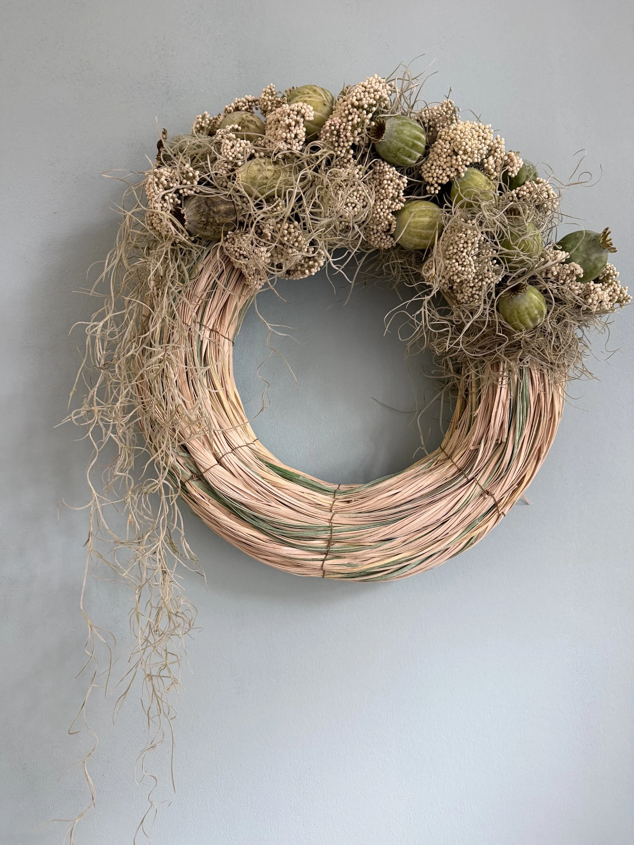
When I returned to my school, I translated the colours of the Atlantic into a contemporary wreath. Rather than copying the landscape literally, I interpreted its atmosphere. Soft blue-grey foliage echoed the sea, muted greens reflected the weathered wooden doors, while layers of texture recreated the feeling of salt, stone, driftwood and coastal grasses.
For me, this is where true floral design begins.
A successful arrangement is not simply a collection of beautiful flowers. It tells a story through colour, proportion, rhythm and texture.
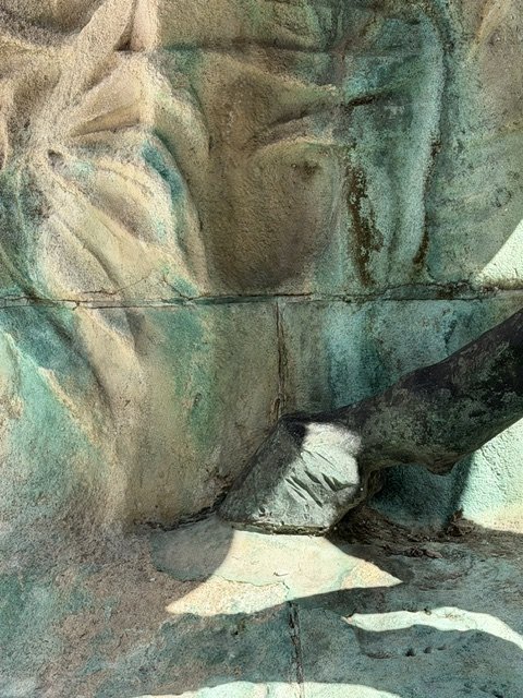
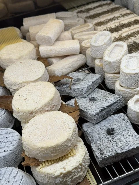
Texture, in particular, has become one of the defining characteristics of contemporary floral design. Smooth petals beside rough bark. Velvety leaves against polished glass. Delicate grasses contrasting with sculptural branches. These subtle relationships create depth long before colour even enters the conversation.
Pattern is equally important. Nature constantly repeats forms—ripples on the sea, cracked paint on harbour doors, the veins of a leaf, the grain of aged wood. As designers, we can borrow these visual rhythms and reinterpret them through flowers and foliage.
Many students ask me where I find inspiration.
The answer is simple.
Everywhere.
The best designers remain curious. They visit museums, travel, observe architecture, collect pieces of fabric, notice the colours of old buildings and pay attention to changing light throughout the day. They are not only florists; they are visual storytellers.
I encourage every student at Berlin Flower School to create mood boards before designing. Not because mood boards are fashionable, but because they train the eye to see connections between seemingly unrelated subjects. A weathered fishing boat, an old ceramic vase, a linen tablecloth and a fading harbour door may eventually become the inspiration for an entire wedding collection.
Flowers should never exist in isolation.
They are part of a much larger visual language.
Perhaps that is why travelling remains one of the greatest teachers for any designer. Every city has its own palette. Every landscape has its own textures. Every coastline tells its own colour story.
The Atlantic reminded me that the most beautiful floral designs are often inspired long before we pick up a single stem.
Love,
Julia